

Leave a spark to say "I'm thinking of you". Stay connected even when life gets busy.
GeoSpark is a mobile app designed to share stories and create reminders by leaving location-based "sparks"—small, thoughtful digital messages tied to real-world places—for themselves, their friends, or the public to discover.
This 2-month solo design project was created for a master’s level “UI Design” course at the University of Toronto.
Check out the design brief here.
Scope of Work
Scenario Development
Task Flows
Storyboarding
Wireframing
Prototyping
Usability Testing
UI Design
Timeline
<2 Months (late Feb-Apr 2025)
Disclaimer: Due to constraints and emphasis on developing UI, this design was developed under specific guidelines and a limited timeline. As such, certain elements of a typical UX process may be noticeably absent as they were out of scope.
The Challenge
Design an easy way to leave a personal message—e.g. a reminder, a memory, or a note to a friend—for someone to discover later in the real world.
(adapted from the original design brief)

Research & Discovery
Due to limited scope, secondary research was not emphasized in this project. I conducted a brief research phase to better understand competitors and identify user needs and pain points. GeoSpark was inspired by geocaching but instead of physical caches, this app offered digital caches for people to create and discover.

I set off to understand how people felt about geocaching/the Geocaching app by interviewing 2 existing users. This is what I learned:
Discovery is meaningful when it's playful, surprising, and earned
People are drawn to caches with emotional or creative significance, suggesting sparks should aim to surprise, delight, or resonate in a personal way.
People are drawn to shared, participatory experiences
Logbooks and community discussions suggest that users value leaving traces behind for others and discovering what others have contributed, even asynchronously.
Physical and logistical limitations impact user experience
Barriers like access, distance, or poor cache quality reflect that GeoSpark should support low-friction, lightweight content creation and discovery—especially in everyday spaces.
These insights and the design brief led me to consider the following problem statement:
“How might we help people leave personal, meaningful messages in the physical world for others to discover later?”
Scenario
To guide GeoSpark's development and highlight the value of the design, I crafted a scenario to demonstrate how users might interact with the product in everyday life. This involved the development of two mini proto-personas, Tom and Ginger.

Photo by Toa Heftiba on Unsplash
Tom: "I want to share my experiences with you."

Photo by Emily Lau on Unsplash
Ginger: "I wish I could keep track of the cute cafes I see."
Scenario: Romantic scavenger hunt
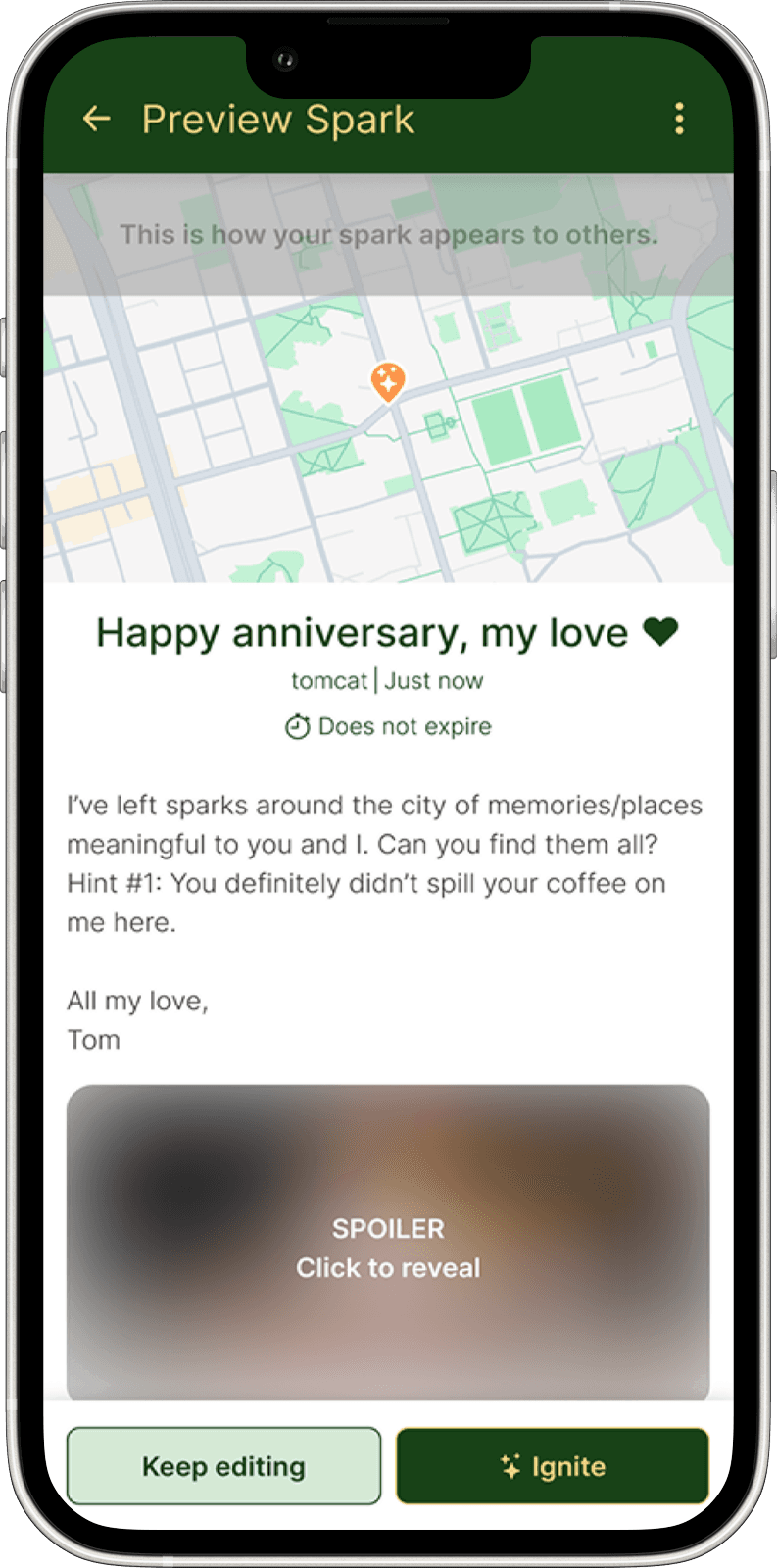
Tom and Ginger are a couple approaching their one-year anniversary. Tom wants to surprise Ginger by using GeoSpark to leave a series of thoughtful messages (“sparks”) at places that hold special meaning for their relationship.
As Ginger explores the city and discovers Tom’s sparks, she notices a charming bakery that catches her eye. She pauses to snap a pic and type out a quick note ("cute bakery to visit with Tom!") as she drops a personal spark to remember the location—a private pin she can revisit later.
This scenario illustrates two types of spark creation central to the design:
Planned, narrative sparks for thoughtful storytelling, like the ones in Tom’s scavenger hunt.
Spontaneous, lightweight sparks for quick personal moments, such as Ginger’s note-to-self.
While sketching out ideas for GeoSpark, there was one quotation that particularly stuck with me:
"Sometimes the point on the map is not the real location […] Sometimes you need to go to the listed point to decode a hint about the real place, etc."
💡 This led to the idea of Spark Paths: a sequence of linked sparks guiding someone through a curated experience—like a digital scavenger hunt, story trail, or memory walk—where each spark reveals part of a message, surprise, or narrative.
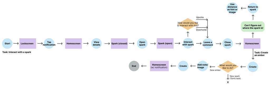
Task Flows
Task 1 (Tom): Create a sequence of sparks that will start at the library and end at a final rendezvous (e.g. Queens Park for an anniversary picnic)
Create a new spark(s)
Set location/trigger radius, visibility to only Ginger, etc.
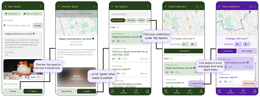
Add the spark to a collection
View the collection of sparks
Link sparks together in a path
Deal with an unexpected hiccup (e.g. ice cream shop closed for renovations!)
Update sparks/spark path as necessary

Task 2 (Ginger): Interact with Tom's sparks and follow the scavenger hunt to where Tom is waiting
Receive notification of initial spark/spark path
Open/view/interact with spark (e.g. upvote/downvote, comment)
Follow hints to locate the next spark
Task 2.5 (Ginger): Create a quick personal spark
Pin a cute bakery on the way for later
Add an image (optional)
Type out a quick note for additional context (optional)
Wireframing & Interaction Design (A2)
I sketched out a few screens using pen and paper, referencing existing apps like Reddit and my phone's calendar app for inspiration, before progressing to Figma to generate some basic wireframes.
Basic, initial sketches
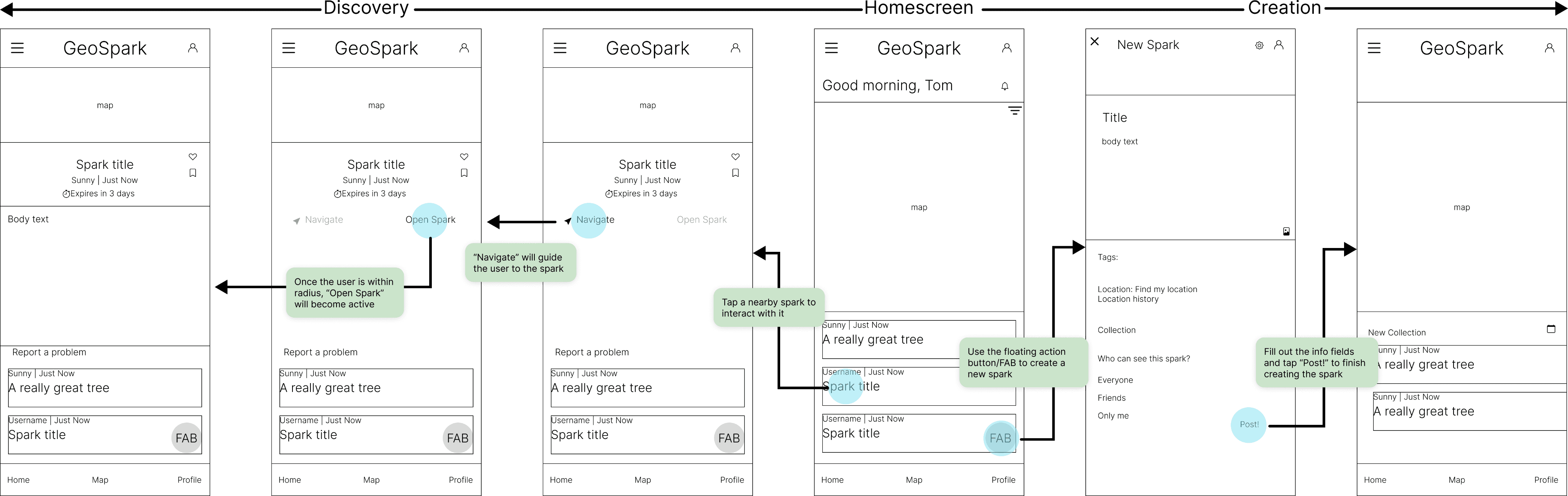
Tom's Route: Spark Creation and Spark Path

Ginger's Route: Discovery and Ember Creation

Design Critique
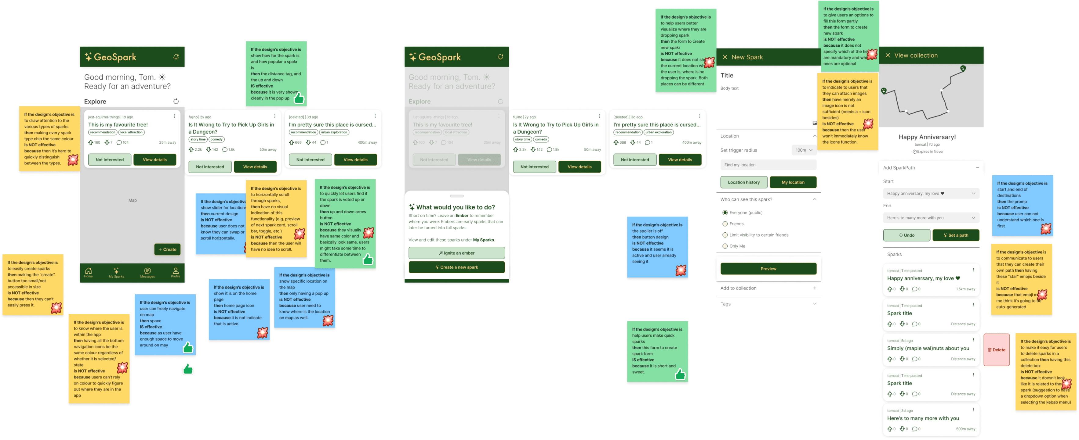
Design critiques from three peers identified weaknesses with navigation/orienting the user and discoverability. These issues were further highlighted and reinforced during usability testing.
Usability Testing
To evaluate the usability of GeoSpark, I conducted moderated testing sessions with 4 participants, each completing tasks from the perspectives of both a spark creator and a recipient. All participants successfully completed the core tasks, including creating sparks, setting and editing paths, opening sparks, and leaving embers. I highlight some of the findings in the following section.
Scenario: “Locate and connect with people at the event. Please complete a ‘recipe’ by interacting with other attendees who represent different ingredients.”
Key findings and improvements
Issue: Navigation issues
Users often tapped the wrong interface elements (e.g. text fields instead of buttons) and overlooked swipeable components like the Explore carousel.
Opportunity: Add visual cues for swipeable content and improve tappable area in line with user expectations.


Issue: Unclear language and labels
Certain actions/terms like “Close Spark” and “Expires in Never” were ambiguous. The original distinction between "embers" (quick) and "sparks" (detailed) were semantically confusing as well.
Opportunity: Reword unclear UI copy and rework spark/ ember distinctions. Default sparks are now quick and personal, but users have the option to change these sparks into more detailed ones by changing the visibility/privacy setting in the corner.
Issue: Visual hierarchy problems
Important features like Collections were frequently missed due to low contrast or a lack of visual cues.
Opportunity: Strengthen the visibility and organization of Collections and key CTAs.


Issue: Expectations mismatches
Users expected location confirmation prompts, more interactive maps, and the ability to create sparks remotely—reflecting mental models from popular apps like Google Maps and Strava.
Opportunity: Provide better confirmation flows and location prompts during creation tasks.
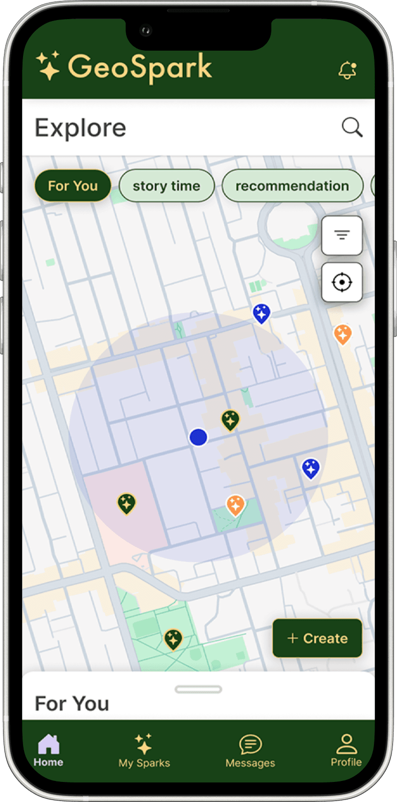
And finally… Introducing GeoSpark
What I Learned
A robust design system ensures consistency and builds trust in the system.
Precise, attention to detail is necessary for consistent, trustworthy interfaces. Learning how to leverage Figma tokens and variables to manage colors, spacing, and typography not only ensured visual harmony, but also made updates fast and reliable.Constructive user feedback reveals hidden gaps and inconsistencies.
Design critique sessions and usability testing were essential for catching gaps and inconsistencies that might otherwise be overlooked. Peer feedback helped me refine hierarchy, improve copy, and clarify interactions. These insights directly shaped the updated prototype, ultimately leading to a more cohesive and polished design.Staying flexible under constraints.
Because this was a solo project under a tight timeline, not every part of the typical UX process was feasible. At first, I felt uneasy skipping steps I’d normally consider critical. But this experience taught me to adapt to real-world constraints while still upholding core UX values—being intentional, iterative, and grounded in user needs.
Next Steps
Conduct foundational user research to validate assumptions, refine proto-personas, and better understand how people engage with location-based content in daily life.
Expand usability testing to more diverse participants outside of peers, capturing varied perspectives and use cases.
Refine interaction design based on deeper research insights—particularly around spark creation, discovery triggers, and spatial navigation.