ConnecTable
Designing a solution to help attendees connect at events.

Have you ever been to an event where you didn't know anyone? What was that like?
ConnecTable is a mobile app that helps solo attendees make meaningful connections at events. Over a 3-month "Fundamentals of UX" course project at the University of Toronto, I led our team through UX research, prototyping, and testing to design a gamified experience that eases social anxiety at events and encourages real-world interactions.
My Role
Defined research goals and conducted user interviews, uncovering key themes and pain points through qualitative analysis.
Designed and tested wireframes and interactive prototypes, iterating on the designs based on user feedback to reduce friction and improve usability.
Presented design rationale and process in 3 stakeholder playbacks, building consensus around a solution expected to encourage social connection at events.
The Problem
People attending events alone often struggle to initiate and build meaningful connections with others at the same event.
(adapted from provided challenge prompt)
The Solution
A platform that supports attendees in identifying those who are open to meeting others and getting to know them through light-hearted, gamified interactions.


What's wrong with the current system?
Secondary Research
Currently, users tend to use MeetUp (left), Bumble for Friends/Bumble BFF (right), or other alternatives such as Reddit/online forums and social media (Discord, WhatsApp) to try to meet other people for events.
We found that popular networking apps tend to focus on pre-event planning, leaving a gap for spontaneous, in-the-moment socializing.


User Research
To gain insight into our users and their experiences connecting with others at events, we conducted 8 interviews to learn about their motivations and pain points related to approaching strangers at events…
So, what do eventgoers think?
Using data reduction and clustering, we combined and synthesized our individual research data in an affinity diagram to uncover common themes.

Users want to meet new people at events: "It's kind of a little bit of a thrill to meet new people. You know, kind of develop your social network, your ability to talk to strangers."
Users view common ground as foundational for connection: "It's much easier to talk to someone when you know you share the same field or interests."
Users find it difficult to approach groups: "Cliques are probably the most challenging part. You have to find a way to break into a clique. If not, you need to be able to quickly identify people that are not part of a clique."
Users are concerned about a bad match: "Let's say you meet someone, but then you realize you don't click. And now you're stuck […] How do you escape that right?"
At a place or event, how might we help users discover and meet others nearby who are open to connecting?
How can we help them disengage if it isn't working out?
To empathize with users and guide our focus, we created Maya, our user persona.
By examining her profile and journey with the current system, we can better understand user pain points and identify opportunities to improve her situation.

Photo by Jonathan Borba
Maya (31), Marketing Coordinator
Finds it difficult to approach and meet people outside of work. She often feels awkward in casual networking situations or social gatherings, worried that she'll be rejected or say the wrong thing.
As much as she loves her phone, she wishes she could do more with it to make the connections she craves.
"I'm eager to make meaningful connections, but starting conversations can be tough."
Let's say Maya decides to attend a casual alumni event hosted by the university she attended.
Goal: Meet other people and expand her network of friends and professional connections (you can do it, Maya!)

Considering the previous motivations/pain points, we concluded that Maya needs:
✅ A way to identify people who are open to meeting others so she can quickly find like-minded people to talk to.
✅ A way to break the ice with the conversational partner so she can start getting to know them.
✅ A way to start building connections and follow-up on them later so she can deepen and return to these relationships.
✅ A way to withdraw from the conversation if she needs a break or if she has determined that the match is not for her.
🧠 Brainstorming in progress…

💡 A social connection recipe task where users are represented by ingredients and encouraged to find other ingredients to complete recipes? Sign us up!
Some considerations
✅ As some users were concerned about safety and the motivations of the other party, we decided to keep profiles/avatars relatively anonymous to protect users' identities and to keep the focus on authentic conversations.
✅ The focus of our solution would be on helping users make that first step to building a connection by facilitating brief encounters that empower the user to easily continue or withdraw from.
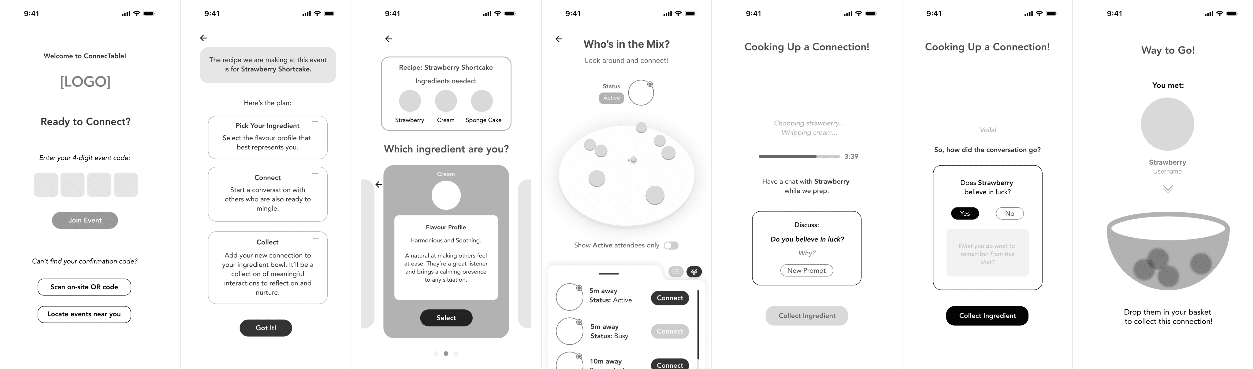
Task Flow
Users can start a recipe task and collect their first ingredient by making a connection with someone else on the app.

Initial Wireframing - Moving from Paper to Digital
My team and I were originally inspired by the user interface of EventBrite's event listings and the layout of Facebook's event pages when developing some of the wireframes below. We considered how our user would find our solution, and we imagined integrating our platform within similar event-hosting platforms.

🛠️ With a little help from our friends…
Usability Testing
To assess whether our prototype was intuitive and met user needs, we conducted usability testing with 8 peers in-person and 1 industry expert over Zoom.
Feedback was generally positive, with many testers expressing that they would be open to using such a tool. However there was confusion with flow and certain screens. I developed two iterations of our prototype based on testing feedback.
Feedback: Simplify the entry/starting point
Since the user is already at the event, there's no need to search for it.
Instead, users can enter a unique code associated with their particular event.

Before testing

After testing

Before testing

After testing
Feedback: Recipe task is unclear
Users may need more context to understand what's going on.
I decided to change the order of screens where the task/choice of personal ingredient is seen first. I also added written instruction ("Try to find them!") to help guide the user.
Feedback: Map is confusing - unsure where to click
We received feedback from several testers that they got stuck on this screen and didn't know what to do next.
To address this, I kept the focus on the recipe task by removing unnecessary event info, providing first-time users with a tutorial cursor to guide clicks, and adding a "list view" tab to filter ingredients while keeping the map clean and uncluttered.


After testing


After testing
Feedback: Connection process could encourage greater communication
Testers generally enjoyed the shaking task so we kept it. However, concerns about superficiality led to the decision to try and deepen the connection process by adding discussion prompts and a time delay to encourage conversations.
Feedback: Reframe the event reward - focus on connections rather than card
While our solution involves gamification, our main goal is connection. I adjusted the end screen to reflect this.
To address how users could connect post-event, and in keeping with the theme of recipes, we implemented a shopping basket to allow users the option of follow-up with mutual swipes into the friend basket or to withdraw if the match wasn't for them.

Before testing

After testing
Our medium fidelity prototype, after improvements
After integrating user feedback, we continued to add polish to our prototype and refine user flow.
From start to finish, the above changes were made with the intention of providing users context and clarity with regards to the intended task, with the added preparation/ discussion screen meant to increase user engagement with their conversation partner.
Following the interaction, users would have the option to add positive matches into their friend basket for later or swipe them away if they didn't wish to continue chatting.
✨ Well, hello, Gorgeous!
Mood Board and Mockups
The team was initially divided on our creative strategy. The feelings I wanted to evoke with our app were warm, safe, cozy, and grounding, with an earthy palette of colours as I believed it would appeal to a larger audience and provide a sense of comfort considering how stressful it can be to approach strangers.
Ultimately we were guided by the phrase, "Joyful Sanctuary" to evoke feelings of comfort and safety as well as playfulness, in-line with our fun, food-centric themed app. We then each came up with a style tile and mock-up frames to reflect this.

Mood Board


Sample mock-ups
Design System
Our design system and high-fidelity screens were a collaborative effort, primarily spearheaded by my team members, Selina Su and Ariel Ma. Softer, more rounded shapes and typefaces were chosen to be more approachable, with bold fonts to stay grounded.

✨ And finally… Introducing ConnecTable


Some Reflections
For me, this project reinforces 1) the critical role of user interviews and feedback and 2) the importance of challenging personal assumptions.
Initially, we believed we had a good grasp of the user experience based on background research and our own experiences attending events. Once we started conducting interviews, however, we realized we were so focused on connecting users that we failed to consider the situation where they might want to disengage. Usability testing further highlighted areas for improvement when testers expressed confusion with the map screen.
Another thing I learned and continue to work on is 3) embracing ambiguity (as uncomfortable as it may be!) and trusting the design process. Real-world problem-solving is more unpredictable than the textbook academics I'm used to, and this project taught me that human-centered design and UX require being open and flexible to change.
Our final design delivered a playful and approachable way to reduce social friction at events, grounded in direct user feedback. Learning to embrace diverse ideas, to take a step back and allow the process to guide our iterations ultimately led to a stronger, more user-centred product.