Context
Graduate course project
Timeframe
Nov - Dec 2024 (3 weeks)
Scope of Work
Information Architecture, Research & Competitive Analysis, Card Sorting, Wireframing, UI Design
Team
Amie Leung (solo project)

Overview
beans. is a fictional online retailer selling coffee beans produced from local roasters. As part of a master's-level Information Architecture course at the University of Toronto, this project explored how to design a clear, user-centred IA for a product listing page. Over 3 weeks, I analyzed patterns across coffee websites, conducted card sorting to understand user expectations, and designed wireframes to support different browsing behaviours and balance usability with user control.
Research & Competitive Analysis
I analyzed five coffee roaster websites—Balzac’s, Detour, Pilot, Propeller, and Gimme! Coffee—to identify layout conventions and compelling UI patterns.
Across sites, I observed a consistent structure: logo and nav at the top, an immersive visual hero section, and navigation using action-oriented labels like “Shop,” “Learn,” and “Visit.” Product listing pages often featured grid views, minimal filtering, and strong visual hierarchy.

Fig. 1: Homepages of five popular specialty coffee roasters.

Fig. 2: Product listing pages for five popular specialty coffee roasters.
Key Takeaways:
Actionable nav labels are the norm (ie. “Shop,” “Learn”, "Subscribe").
Filters vary in placement (left vs. top), but grid layouts dominate.
Product cards prioritize image, brief description, and price.
Card Sorting to Validate Navigation
To test how users interpret navigation groupings, I ran a closed card sort with 7 participants using UXtweak. Categories were drawn from both competitor sites and CSV content provided for the fictional shop.


Findings:
Strong alignment (86–100%) for categories like “Shop” and “All Coffee.”
Terms like “Single Origin” and “Blends” split between “Shop” and “Learn,” suggesting different mental models between coffee enthusiasts and casual drinkers.
Unexpectedly, most users (86%) associated “About Us” with “Visit” rather than “Learn.”
Website Schematic
Based on research and user testing, I proposed a four-category structure: Shop, Subscribe, Learn, and Visit. The nav uses concise, familiar labels to match user expectations and support intuitive scanning.

Fig. 3: Proposed website schematic diagram for hypothetical coffee shop website.
Design Considerations:
“Shop” includes subcategories like Single Origin, Blends, Decaf, and Holiday Collection.
“Learn” provides brew guides and an optional coffee quiz for less experienced users.
“Visit” contains location and company info, aligning with user expectations as observed from the card sort.
Wireframes – Two Product List Pages
To explore layout trade-offs, I initially created two wireframes with different structural choices.
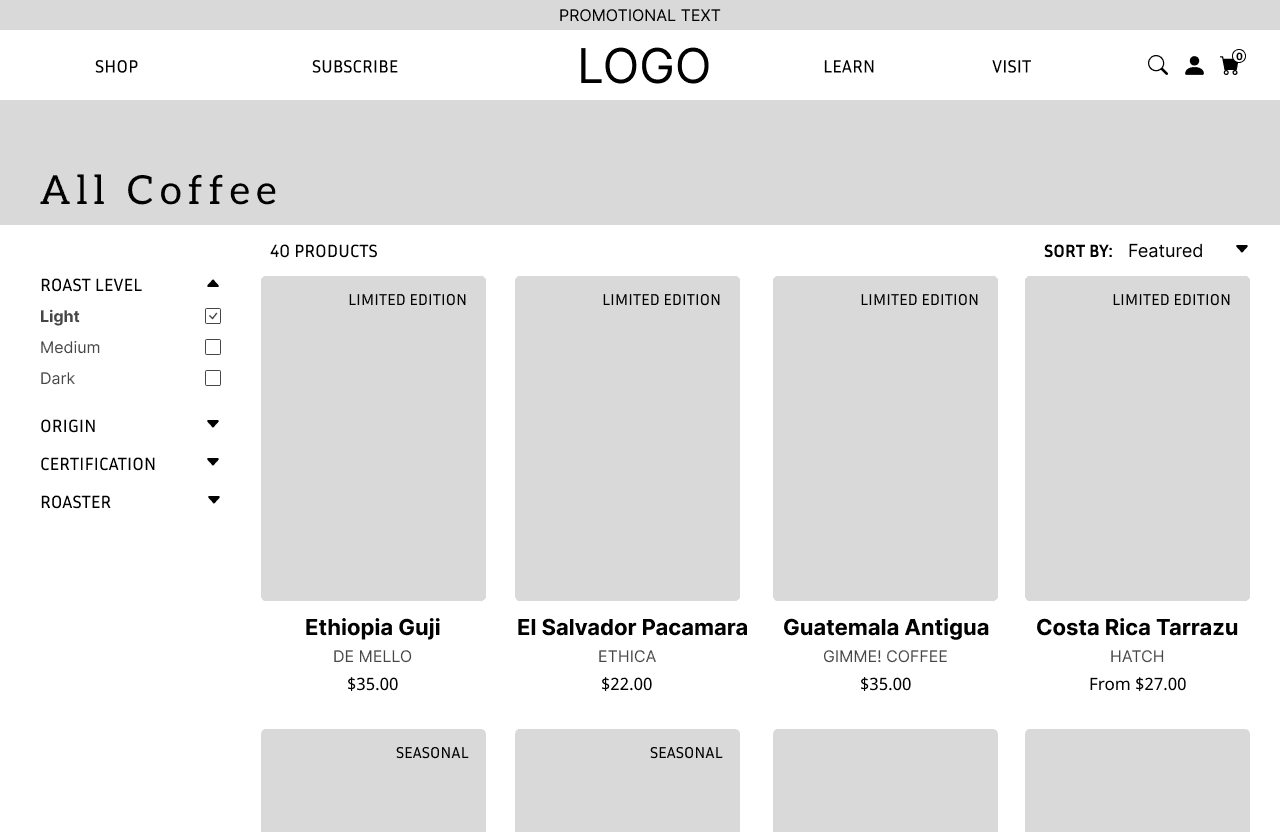
Version 1 (Establishing the structure):
Introduced a basic layout with:
Left-aligned vertical filters for roast level, region, etc.
Top-level navigation bar (logo in the middle, flanked by nav categories)
Product grid with images and titles
Sorting dropdown above and to the right of the grid
Focused on familiar e-commerce patterns to ground the initial layout
Identified early mobile limitations (e.g., vertical filters taking up space)

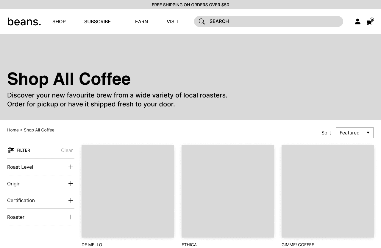
Version 2 (Exploring alternative layouts):
Moved filters above the product grid to reduce scrolling and improve scanning
Added:
Icon labels for clarity
More visible product tags (e.g., “Limited Edition”)
Pricing drop-downs to potentially save clicks and clearer call-to-action buttons
Bonus Wireframe - Product Listing Page
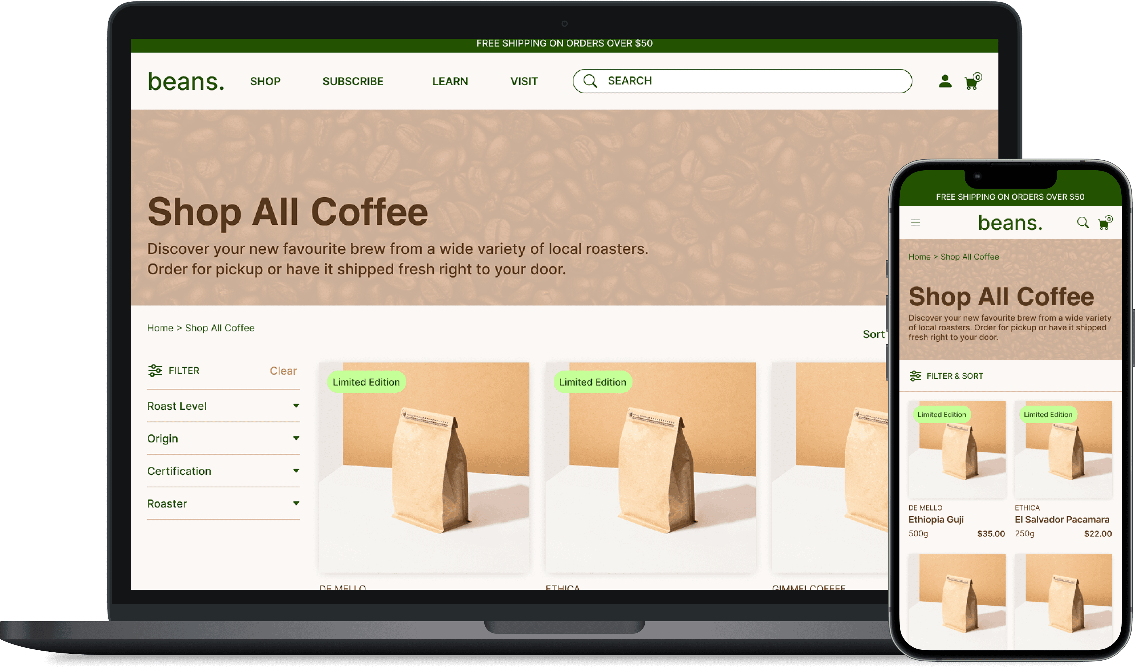
Curious to explore a more balanced layout, I developed a third version, combining strengths from the earlier wireframes while introducing new elements to further improve usability.
Version 3 (Combining elements from V1 and V2):
Changed search icon to a search bar to increase visibility of the search feature
Expanded hero banner to highlight featured products and provide users with a more immersive entry point to the product listing page
Added breadcrumb navigation to improve wayfinding and help users understand where they are in the product structure
🎨 A Brief Exploration into UI
Elevating the project beyond its initial scope, I extended the wireframes into higher-fidelity mockups by considering colour, typography, and tone.
Tone: Warm and inviting, earthy, grounded, conscious and modern
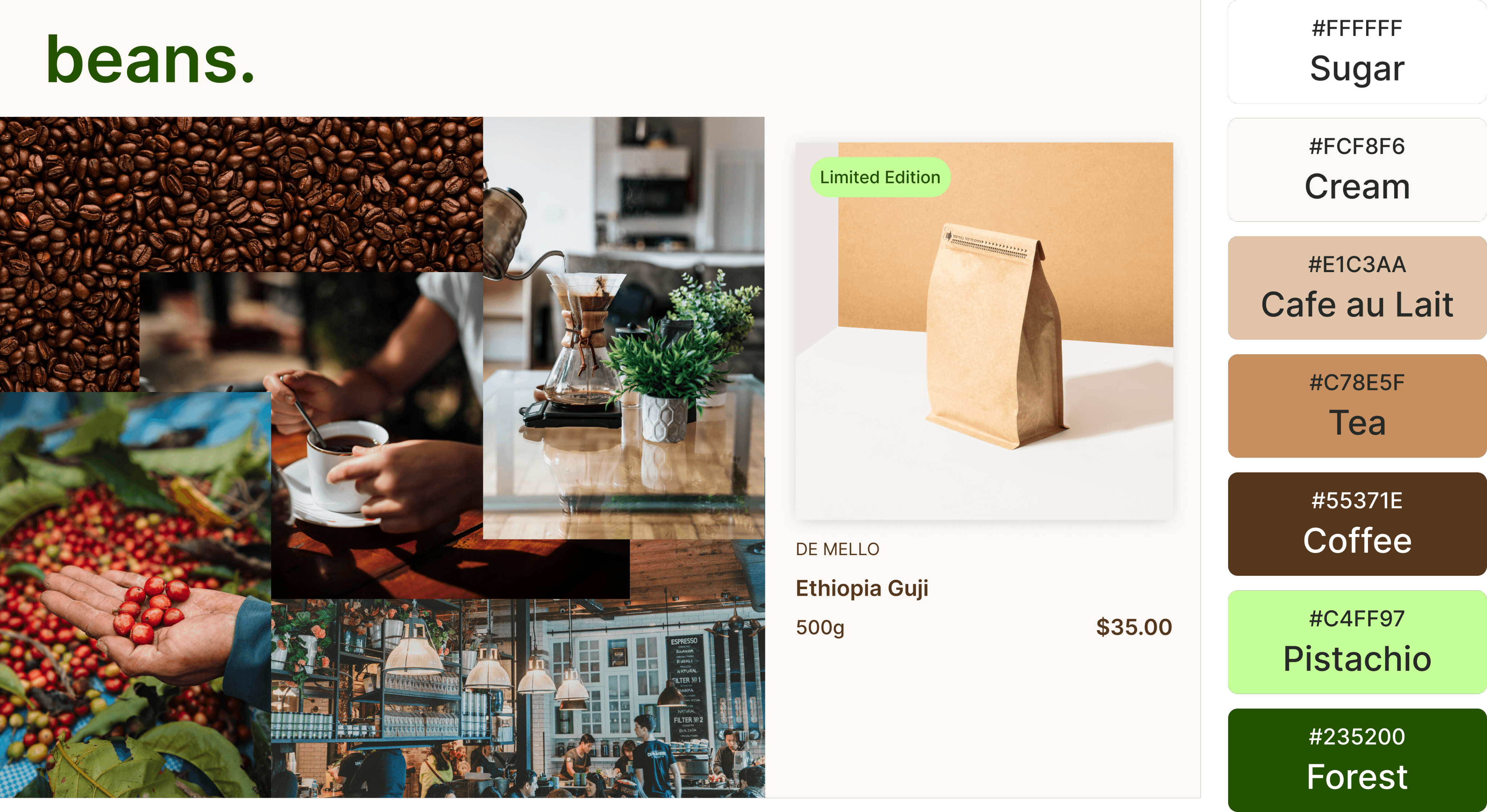
Colour palette: I selected warm browns to evoke the feeling of comfort that coffee brings, complemented by earthy greens to signal the fictional brand's commitment to sustainability.
Typography: The typefaces Inter and Helvetica were chosen for a clean and modern feel. Inter Medium was primarily used for readability and Semi Bold/Bold for emphasis.
A great cup of coffee starts with great beans. Discover your new favourite brew with beans.
Some Reflections
This project represents my first foray into Information Architecture and emphasized the value of aligning navigation and layout with user mental models.
Key takeaways:
User assumptions aren’t always reflected in existing UI patterns—research is critical.
IA decisions (filter placement, nav wording) directly affect usability and product discoverability.
Flexibility for future growth (e.g., expanding beyond coffee) is worth building in early.
Next steps would include fully developing the webpages beyond a static image, usability testing and iteration to refine for mobile responsiveness and accessibility.